Intro to HTML/CSS
Class 4
Float: Example
Below, a <blockquote> is floated to the left, allowing text to wrap around it on the right

Property: Float
- "Floating" an element moves it as far to the left or right of its containing element as possible.
- Any other elements, such as paragraphs or lists, will wrap around the floated element.
- Always specify a
widthwhen floating an element—otherwise the element is likely to take up the whole width of the container and not appear floated. - You can specify a) whether an element is floated or not, and b) which side it floats on.
Float
.float {
  float:left;
  width:200px;
  background:yellow;
}
I like to hang out on the left side.
Placing elements side by side
If you want two block level elements to be side by side, you need to float both elements. One left, and one right.
width: 300px;
float: left;
width: 400px;
float: right;
Clear
- Clearing tells the element on which side (
right,left,both) other elements cannot appear. - If you had an image floated left, and you did not want the paragraph to wrap next to it, you would add
clear: left;to the paragraph. - Clearing
bothensures the element doesn't wrap next to floats on either side.
clear: right;
clear: left;
clear: both;
Clear
.float {
  float: left;
  width: 150px;
  background: yellow;
}
.clear-left {
  clear: left;
}
.clear-left drops below the floated element.Let's Develop It
- Use
floaton your sidebar and content areas. - Experiment with floating other elements, like images.
- What happens when multiple elements are floated to the right?
- When would you want to clear a float?
Static Positioning
- All HTML elements are positioned
staticby default. - Static elements are positioned in the normal flow of the page.
- Static elements ignore
top,bottom,right, orleftproperty specifications.
Static Positioning:
Inline Elements
In normal flow, inline elements flow from left to right, wrapping to next line when needed.
<img src="img/otter.jpg"/>
<img src="img/otter.jpg"/>
<img src="img/otter.jpg"/>
...
<img src="img/otter.jpg"/>
<img src="img/otter.jpg"/>


Static Positioning:
Block Elements
In normal flow, block elements flow from top to bottom, making a new line after every element.
<p>Greetings</p>
<p>Hello</p>
<p>Hi there!</p>
Greetings
Hello
Hi there!
Relative Positioning
The "relative" value will still put the element in the normal flow, but then offset it according to top/bottom/right/left properties.
.relative {
  position: relative;
  left: 80px;
  top: 20px;
  height: 100px;
  background-color: yellow;
}
Relative Positioning
- Takes the element out of the normal flow, allowing it to be moved in relation to the
top,bottom,right, orleft. - Does not affect the elements surrounding it.
- Makes an element a "positioning context" in which to position other elements relative to it.
Absolute Positioning
The "absolute" value will take the element out of the normal flow and position it in relation to the window (or the closest non-static ancestor).
.top {
  position: absolute;
  top: -40px;
  right: 10px;
  background-color: yellow
}
.bottom {
  position: absolute;
  bottom: -40px;
  left:60px;
  background-color: green
}
Absolute Positioning
- Positions element outside of the normal flow—other elements act as if it's not there.
- An absolutely positioned element is offset from its container block, set with the properties
top,bottom,right, andleft. - Its container block is the first surrounding element that has any position other than static.
- If no such element is found, the container block is
<html>.
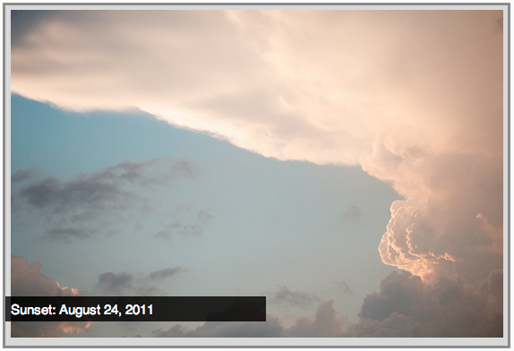
Example: Absolute Positioning
Here's an example of an image with a caption absolutely positioned in front of it.
The containing div has a position of relative, and the caption has a position of absolute.

Fixed Positioning
The "fixed" value will take the element out of the normal flow and position it relative to the viewport.
footer {
  position: fixed;
  bottom: 3px;
  left: 0;
  height: 40px;
  width: 100%;
}
Do you see the fixed footer in these slides?
Z-index
Sometimes elements overlap. You can change the order of overlapping with z-index. The element with highest z-index goes on top.
.bottom {
  position: absolute;
  bottom: 10px;
  left: 60px;
  background-color: yellow;
}
.top {
  position: absolute;
  bottom: 15px;
  left: 60px;
  background-color: green;
  z-index: 2;
}
Let's Develop it!
- Create a
divthat contains an image and a caption. - Position the caption absolutely in front of the image.
- Bonus: Use semantic HTML5 elements for your image and caption.
- Bonus: Use fixed positioning for your header or footer.
Closing Out
- What is HTML5? What do we gain by using it?
- What can we use to position elements with CSS?
- What technical struggles did you overcome today?
- What's next to continue your learning?
We love feedback! Please leave us some kind words and actionable suggestions.